Tips for Designing Powerful and Persuasive Slide Presentations
by Adele Sommers
 Just about everyone who has spent any amount of time in the corporate world has watched someone give a slide presentation that put the whole audience to sleep. Many of us were taught to follow a familiar model of designing presentations that, unfortunately, does not sustain attention or understanding. Just about everyone who has spent any amount of time in the corporate world has watched someone give a slide presentation that put the whole audience to sleep. Many of us were taught to follow a familiar model of designing presentations that, unfortunately, does not sustain attention or understanding.
You know the type I mean -- the text-heavy, bullet point-crammed slides, often covered with dense charts and detailed diagrams that can't possibly be read even at close range, much less from across the room. Throw in a heavy lunch, deliver it in mid-afternoon, and voila! You have a recipe for a coma!
The sad part about presentations like these is that the most valuable information gets distorted, buried, or simply discarded. Between the poor design of the visuals and the lack of story-telling flair, we can make it nearly impossible for our audiences to grasp and retain the meaning of what we're trying to convey.
To help remedy the situation, this article discusses presentation design tips and techniques that can boost your audience's ability to interpret and respond to your proposals, concerns, analyses, and ideas.
How Can We Improve Presentation Design?
The presentations we create must be "high-impact" to get attention, but also "low-bandwidth" in terms of the effort and brain-power required to process them. When we communicate with simple, clearly designed messages, people will more readily:
- Retain the information
- Retrieve from it memory under the right circumstances, and
- Take action on it in the way you intended
Presentation design principles come to the rescue by:
 Easing the burden on the viewer's brain by reducing the information processing load. Easing the burden on the viewer's brain by reducing the information processing load.
- Working within the limitations of short-term memory.
- Using several other extensively researched principles of perception and learning.
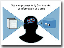
Studies published in 1956 by George
Miller indicated that our short-term memories can handle about "7 plus or minus 2" chunks of information at a time. Nearly 50 years later, however, Nelson Cowan revisited Miller's and others' studies. After looking a host of new research in 2001, he discovered that we're really only capable of assimilating about 3-4 chunks of information at once. That's not very much processing power!
What exactly do these limitations mean for our presentations?
We Need to Go "Beyond Bullet Points"
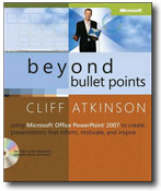
Cliff Atkinson is a master of presentation design. His articles, presentations, and newly updated book, "Beyond
Bullet Points: Using Microsoft Office PowerPoint 2007 to Create
Presentations That Inform, Motivate, and Inspire,"
will completely alter your previous beliefs
about using text-based slide shows.
 Atkinson has pondered PowerPoint presentations with the same zeal and thoroughness that aspiring surgeons have studied anatomy. His findings may surprise you... Atkinson has pondered PowerPoint presentations with the same zeal and thoroughness that aspiring surgeons have studied anatomy. His findings may surprise you...
Did you know that you can actually reduce your audience's understanding
of your material by using slide presentation templates
that bear your company logo and identification? (That's because these elements can distract attention from the main content.)
Or that the use of mostly text-based
slides, without any illustrations or meaningful organization, can overwhelm short term memory, working
against the audience's ability to successfully process,
store, and retrieve the material?
Atkinson cites research by Dr. Richard E.
Mayer (see Mayer's "Multimedia Learning") and others who have experimented with the phenomenon of cognitive overload.
For example, Dr. Mayer found that by simply adding relevant illustrations to text-only presentation materials, learners experienced the following benefits:
- Retention increased by 23%, and
- Their ability to later apply the information increased by 89%.
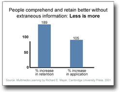 Likewise, even more dramatically, Mayer found that by simplifying the material -- which meant removing everything that wasn't directly related to the discussion: Likewise, even more dramatically, Mayer found that by simplifying the material -- which meant removing everything that wasn't directly related to the discussion:
- Retention increased by 189%, and
- The ability to later apply the information increased by 105%!
This last finding provides a powerful incentive to avoid including graphics or multimedia effects simply for the sake of including them. If you want the audience to retain the information, less is more. That means incorporating only the graphics that closely relate to your content, and removing all extraneous, distracting details -- including company logos.
In contrast, if you simply want to entertain your audiences without worrying about retention, you could potentially go crazy with special effects!
Use a Simple, Graphical, Story-Telling Approach
Drawing on all of this research, Atkinson
proposes an entirely different model for presentations. His method emphasizes a cinematic storyboard technique, rich
but concise imagery, and verbal narration.
He asserts that in order
to convey our ideas convincingly, we should apply
a movie metaphor to craft a compelling visual and
auditory narrative -- not an endless
stream of bullet-point lists.
Atkinson believes that
to help people make informed decisions about complex
topics, we need to "blend one part storytelling,
one part persuasion, and one part Hollywood screenwriting
to create a powerful approach" to presentations.
 But instead of infusing our presentations with excessive
special effects, Atkinson recommends a methodology to organize
our thoughts into compelling, scalable stories
that flow like movies.
This approach includes breaking the material into meaningful chunks (say, 3-4 main topics or ideas) that your audiences can easily absorb. But instead of infusing our presentations with excessive
special effects, Atkinson recommends a methodology to organize
our thoughts into compelling, scalable stories
that flow like movies.
This approach includes breaking the material into meaningful chunks (say, 3-4 main topics or ideas) that your audiences can easily absorb.
Aiming
the Spotlights
Atkinson's
formula parallels a three-act play:
- Act I sets the stage by giving a short overview of a conflict that the protagonists (your audiences) are experiencing, and recommends a solution.
- Act II then "develops
the action" by elaborating
on three to four main points of the solution. Here, you would present each main point and then summarize it before moving on to the next main point, which strengthens understanding and retention. Depending on the total amount of time available to present, you can expand or reduce your Act II discussion accordingly.
- Act III
recaps the problem and the solution to
help the audience fully digest the story. This short segment summarizes and completes the presentation.
Further, Atkinson says, each content slide should:
- Cover only one central idea.
- Use a single, complete sentence as a heading.
- Avoid or minimize the use of bulleted lists of text.
- Include a relevant image or simplified diagram to boost retention and recall.
In conclusion,
with any type of presentation --
persuasive, informational, technical, or instructional
-- you can use these guidelines
to strengthen your logical case and emotional connection. You can thereby leave your audiences with clearer and more compelling
reasons to embrace and retain your ideas, and take appropriate actions.
Copyright 2008 Adele Sommers
|


 Today's
newsletter issue focuses on using effective presentation design and persuasive story-telling
to communicate compelling and convincing ideas
to your colleagues, clients, customers, employers,
personnel, and students.
Today's
newsletter issue focuses on using effective presentation design and persuasive story-telling
to communicate compelling and convincing ideas
to your colleagues, clients, customers, employers,
personnel, and students. Have
you attended a Webinar lately? The term Webinar
is short for "Web seminar," which refers to
the virtual meeting space where people from all
over the globe can tune in to hear and interact with
a live presenter.
Have
you attended a Webinar lately? The term Webinar
is short for "Web seminar," which refers to
the virtual meeting space where people from all
over the globe can tune in to hear and interact with
a live presenter.