Overcome Audience Overload with
Presentation Design Best Practices (Part 2)
by Adele Sommers
Did you know that we’re witnessing an epidemic — a presentation pandemic — of meeting attendees who are becoming increasingly glazed over by an antiquated style of presentation design?
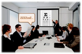
 I’m sure that we’ve all watched someone give a presentation that lulled the entire audience into a coma. As we began exploring in Part 1 of this series, a sleep-inducing talk might contain too little structure, too much text, too many complex details, poor visuals, or a combination of these. I’m sure that we’ve all watched someone give a presentation that lulled the entire audience into a coma. As we began exploring in Part 1 of this series, a sleep-inducing talk might contain too little structure, too much text, too many complex details, poor visuals, or a combination of these.
In contrast, I know that you would much rather produce enthralling presentations using powerful visual techniques that convey your core message!
For this reason, Part 1 included a certain set of findings by multimedia-learning researcher Dr. Richard Mayer. The specific series of experiments revealed that when we add relevant graphics to text-only content, the combination of reduced text and meaningful images can significantly
increase our audience’s ability to absorb, retain, and apply our ideas.
But what are relevant images? Relevant images pertain directly to your content, and help illustrate the main idea or the subordinate ideas on a slide. Some of the most effective are simple and symbolic. In presentations, crisp, clear photographs or similar renderings are preferable to cartoon-like clip art. But don’t be deterred by not knowing where to find them. Locating high-quality, royalty-free images that you have permission to use for business purposes is becoming much easier. If in doubt about usage restrictions, review the image source’s terms of use carefully.
Note: Relevant images do not mean slide decorations, such as overt background patterns. As we’ll soon see, “eye candy”
actually can reduce understanding. It often competes with the content and becomes a hypnotic distraction that viewers must subconsciously find a way to ignore.
What about text? Be aware that using some text, such as a complete sentence to describe the main idea on the slide, is desirable. Sometimes no text is needed. But too much text, especially without relevant imagery, quickly contributes to audience overload. Yet there may be occasions when the theme of your discussion will revolve around text, such the use of language or other abstract concepts. In those cases, try to limit what appears on a slide to one clearly displayed example or idea grouping at a time. Aim for at least 24-point text on a high-contrast background color.
So, how do we avoid major mistakes, such as saturating our audiences with non-relevant graphics, extraneous visual clutter, and too many textual details?
This article, Part 2 in the series, focuses on how these specific design breakdowns occur, and explains how we can continue to overcome “audience overload.”
Why less is more in presentation design
Have you ever wondered what goes on the minds of attendees who tune out, glaze over, or otherwise give up on trying to make sense of what they can’t read or absorb from the screen?
Imagine that you could listen in on every subtle conversation that occurs in the minds of audience members who are struggling to keep up with dense, rapid-fire slide details while their brains are slowly melting down. (Or, simply listen to your own little voice “talking back” whenever you find yourself in that situation!)
 For example, you might hear inner chatter like this: For example, you might hear inner chatter like this:
- “I can’t decipher that tiny text — what the heck is it saying?”
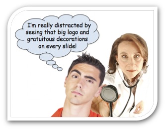
- “Is that purple blob on the screen a logo or is it part of the content?”
- “What a hideous color scheme! The text-to-background contrast is horrible, which makes everything impossible to read!”
Just imagine how distracting those kinds of involuntary, subliminal conversations are to attendees. The fact that they are having those discussions with themselves means they are not listening to you. The solution is to try to prevent as much of the internal chatter as possible!
Are logos also considered “non-relevant graphics” that distract viewers?
Many people feel that they ought to “brand” every slide with their corporate logo.
Your company might even have a policy that requires everyone to use a template bearing the business identity.
But logos are examples of artifacts that the audience must find a way to tune out, since they also can compete visually with the content.
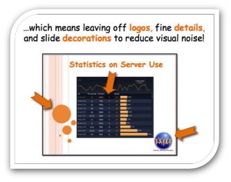
A better approach is to place the logos prominently on the first and last slides only. If there is a desire to include logos on every slide, the logos could become very small, subtle treatments that fit inconspicuously at the bottom, so that they aren’t obvious to viewers.
Other examples of non-relevant images include artsy slide decorations, which came into vogue to help people “illustrate” text-heavy slides. But adornments like bubbles, stripes, and overt patterns are a weak way to create visual interest, and are not a substitute for thoughtful slide design. A simple, thematic color scheme is fine, but it’s crucial not to step over the line and pile on non-relevant decorative images.
Logos and slide ornamentation are therefore examples of “visual noise” that can prevent our audiences from fully absorbing our message!
Here are even MORE reasons to leave off extraneous details...
 Since many presentations deal with factual and data-oriented topics, let’s take a look at a few egregious chart violations. Since many presentations deal with factual and data-oriented topics, let’s take a look at a few egregious chart violations.
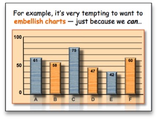
For instance, it’s very enticing to glamorize charts with special effects, including 3-D rotations, backgrounds, patterns, bevels, textures, reflections, and drop shadows, as illustrated at right.
We often layer on these features simply because we can, perhaps because they look impressive.
Instead, these busy, mind-numbing effects create even more visual interference. They make it difficult, if not impossible, for viewers to interpret our key points on the fly.
Is there research on what these gratuitous effects do to viewer’s brains?
Yes! Here’s a remarkable study, which offers another reason why less is more...
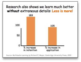
Dr. Mayer found that simplifying visuals by removing everything that wasn’t absolutely required to understand the material (such as chart lines, decorative art, fancy doodads, and lower-level details) produced the following benefits:
• Retention jumped by 189%
• The ability to later apply the information increased by 105%!
This set of findings suggests that regardless of how snazzy our chart, graph, or diagram effects seem; or how strong the requirement is to plaster branding art on every slide; or how uncontrollable our desire becomes to cram slides with low-level details, refraining from doing these things will pay huge dividends. Not doing them substantially increases audience understanding and reduces audience overload. Doing them has the opposite effect.
So, where should we put our details, logos, and other branding?
 In the handouts! Our handouts are indispensable tools that can help our audiences consume the main topics and details during our presentations, as well as have a resource to refer to later. In the handouts! Our handouts are indispensable tools that can help our audiences consume the main topics and details during our presentations, as well as have a resource to refer to later.
Since handouts are a logical place to relegate the fine points that would be difficult for audiences to read on the screen and to remember, they provide support for both working memory and long-term memory.
In fact, as you develop the content for your talk, you might find it expedient to work on your handouts simultaneously. That way, each process can inform the other as you build out your material.
To summarize the recommendations so far...
We’ll tag onto the first three recommendations from Part 1 by adding 4, 5, and 6:
1. Chunk your material into no more than 3 to 4 main sections or topics.
2. Minimize text, such as by combining a full sentence with a relevant image.
3. Don’t use your slides as a talking script or read your slides to the audience.
4. Use relevant graphics that relate directly to your content to illustrate ideas.
5. Avoid slide decorations, detailed data, and flashy logos to reduce distraction.
6. Use handouts to embody your fine points, logos, and other branding elements.
For additional ideas, you might want to refer back to:
Stay tuned for Part 3 when we will wrap up this important conversation!
Copyright 2015 Adele Sommers |


 Do the presentations you attend leave you (and everyone else) blinded by undecipherable and mind-numbing details?