Overcome Audience Overload with
Presentation Design Best Practices (Part 3)
by Adele Sommers
We’ve come full circle in our presentation design series thus far! This is the final article on ways to prevent audiences from becoming overwhelmed by visual chaos and clutter. It provides a recap of the tips we’ve covered so far, and adds a few more best practices to assist you if you’re working with more technical subjects.
 In Part 1 of the series, we observed how a sleep-inducing talk might contain too little structure, too much text, too many complex details, poor visuals, or a combination of factors. We also explored some of the data from multimedia-learning researcher Dr. Richard Mayer’s trials that have exposed the merits of combining text and graphics in specific ways. In Part 1 of the series, we observed how a sleep-inducing talk might contain too little structure, too much text, too many complex details, poor visuals, or a combination of factors. We also explored some of the data from multimedia-learning researcher Dr. Richard Mayer’s trials that have exposed the merits of combining text and graphics in specific ways.
In Part 2, we continued to examine more of Dr. Mayer’s eye-opening experimental findings, and listened in on the quiet, subliminal conversations that our attendees have as they struggle to make sense of the haphazard, mind-numbing, or badly designed visuals that they often see on a screen.
Part 3, below, combines all of these insights into a summary of eight important tips, and then adds two additional suggestions for a total of ten.
If you aren’t by now, you will soon be a pro at avoiding the major presentation mistakes we’ve been discussing. Moreover, you’ll create the kinds of productions that levitate your audiences off of their chairs, eager to respond to your call to action!
 Here’s a summary our slide-design tips so far... Here’s a summary our slide-design tips so far...
Let’s take stock of
several of the design tips we’ve covered so far in this series. They pertain to how we initially organize our ideas, what to include and what to leave off of our slides, and how to combine the on-screen components for the very best possible effect.
First of all...
Organize your ideas into 3 to 4 main “suitcases”
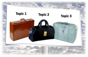 1. Structure your material into no more than about 3 to 4 main “containers” of ideas, which are your top-most sections or topics. 1. Structure your material into no more than about 3 to 4 main “containers” of ideas, which are your top-most sections or topics.
This strategy reduces audience overload by focusing on the most memorable “takeaways.”
It’s much easier for attendees to take away a short list of big ideas than many disparate small ones. And if they can refer back to the handouts to see the lower-level details, that will also help them conserve their precious cognitive processing power!
Use a clean, “billboard” approach to design...
 2. Keep slide composition simple, and relegate intricate fine points to your handouts. 2. Keep slide composition simple, and relegate intricate fine points to your handouts.
3. Minimize the use of lists; don’t depend on simple outlines to convey all of your ideas. And please avoid using the slides as a substitute for speaker notes.
Why? Using mostly dense text on slide after slide is difficult for people to read on the fly, and it significantly increases overload!
4. Refrain from using prominent logos, slide decorations, and other “visual noise” that would subconsciously distract the audience.
5. Eliminate intricate styling, and simplify charts, graphs, and diagrams by removing all nonessential elements. Once again, put the details into the handouts.
6. Avoid mixing competing colors; use only high-contrast text and background tones. Choose only a few clean fonts that are at least 24 points in size so they will be clearly readable from across a room.
...And present only one main idea per slide!
 7. Aim to display only one key concept on each slide. 7. Aim to display only one key concept on each slide.
Include a relevant graphic on each slide whenever applicable.
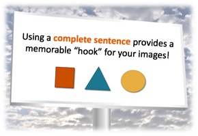
To make it more memorable and informative, label the slide or graphic with a full sentence in most cases.
Note: Not every slide will need an explanation. There are times when an image alone conveys an idea dramatically, especially when it covers the entire slide!
8. When language usage or other abstract concepts are your main subject, try to represent the content in a crisp, “image-like” way. Break up any dense text and present it across several slides, focusing on just one clearly displayed idea set or example on each slide.
 Why only one idea per slide? Well, condensing your information onto a few slides may seem like a lot less work for you. But making sense of it will involve much more work for your audience. Why only one idea per slide? Well, condensing your information onto a few slides may seem like a lot less work for you. But making sense of it will involve much more work for your audience.
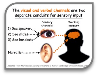
That’s because you’re asking viewers to scan, interpret, and digest a lot of input at once, which experiments have shown quickly leads to overload.
People are trying to split their attention among the visual and verbal elements (which include you, the slides, and the handouts). Too many stimuli can cause a “traffic jam” in working memory!
A better approach is to spread your ideas across many slides, where each has a main concept, a relevant illustration as applicable, and a descriptive label or caption. This technique chunks everything into bite-sized pieces, which will be much easier for your audience to process and comprehend.
Remember — contrary to the urban myths about slide presentations — you really cannot have too many well-structured, clearly illustrated slides. There is no theoretical limit to the number of slides “allowed,” other than what you can present comfortably in the time allocated. But you can have way too much poorly organized information crammed onto just a few slides!
And here are two final tips on handling complex images...
Do you ever need to work with complicated technical or scientific topics? If so, you know that interpreting the related graphics can produce challenges for presenters and audiences alike. So, what can you do? Below are some ideas...
9. Emphasize the main features and de-emphasize the secondary features in complex diagrams or graphics.
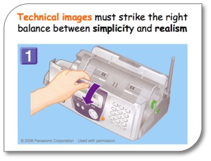
Even though good-quality photos (rather than clip art) are almost always preferred for presentation graphics, the guidelines change if you are working with technical items, such as equipment. In these situations, photo-realism can actually be counterproductive.
Why? Photos that show every minute detail in a mechanical device can produce their own “visual noise,” making it more difficult to discern the focal point for action.
This phenomenon occurs even at close range, such as in a trouble-shooting guide. Therefore, the best practice is to graphically downplay the secondary features in favor of
the primary ones, both on-screen and in printed materials.
10. Use “progressive disclosure” to reveal one difference, one area of detail, or one variation at a time.
 This last tip can save you from pulling your hair out when trying to re-render a very complex illustration... This last tip can save you from pulling your hair out when trying to re-render a very complex illustration...
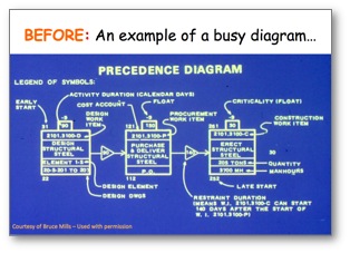
Some diagrams have many dimensions that really must be viewed to gain an overall understanding of the subject matter. For example, see the precedence diagram at right.
The problem is that the fine details are too much to
take in at one time. Where would we even start a discussion? The diagram itself does not give us a clue.
Fortunately, we can use a trick called “progressive disclosure.” It allows us to break up a diagram over a series of slides, showing only one area of emphasis at a time.
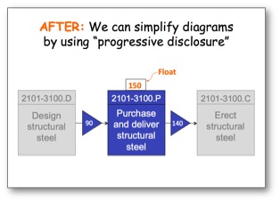
The “after” version of the same diagram, at left, has been simplified somewhat. But it also has been split into three parts to appear on three separate slides.
What appears in this view highlights the second part. It emphasizes the focal point of that discussion — the middle step of the process. It minimizes the first and third steps with grayed-out tones, while still leaving them in place for context.
Each progressive step receives a similar treatment over the series of slides in this particular example.
There are many ways to apply the principles of progressive disclosure, not only for diagrams, but also for financial or statistical data, for example. But I hope this will give you some food for thought for your very next detail-rich presentation!
In conclusion, an engaging slide presentation helps broadcast a clear, powerful message; you might have only one chance to convey your thoughts effectively. So, the more of these best-practice techniques you apply, and the fewer obstacles to understanding you introduce, the more your audiences will benefit from your ideas and information!
For additional ideas, you might want to refer back to:
Copyright 2015 Adele Sommers
|