Overcome Audience Overload with
Presentation Design Best Practices (Part 1)
by Adele Sommers
A major dilemma we face as presentation designers is that it’s very difficult to curb our desire to tell people everything we know.
 This challenge seems universal because many of us love talking about our favorite subjects. If given a chance, we could go on forever! This challenge seems universal because many of us love talking about our favorite subjects. If given a chance, we could go on forever!
But the problem is that our audiences have only a limited capacity in what is known as “short-term memory” or “working memory” to handle all of the incoming information. What is going on up there?
You can think of working memory as a kind of cramped processing center where gobs of input are constantly arriving and are waiting to be packaged, moved, and stored in long-term memory. Yet, only a tiny fraction might ever make it to that destination.
Much like trying unsuccessfully to drink from a fire hose, our meager, underpowered working memories simply discard anything that they can’t quickly sort out. That’s why this article, Part 1 in a series, focuses on why those limitations exist, and what we can do about overcoming “audience overload” in our presentations.
Here’s one reason why our audiences are easily overwhelmed...
We can process only about 3 or 4 chunks of information at a time
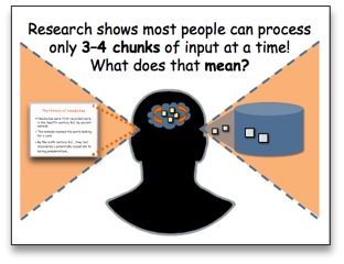 You may have heard about memory studies that were initially published in 1956 by Dr. George Miller. He became known for proposing the theory that our short-term memories can handle around “7 plus or minus 2” chunks of input at one time. You may have heard about memory studies that were initially published in 1956 by Dr. George Miller. He became known for proposing the theory that our short-term memories can handle around “7 plus or minus 2” chunks of input at one time.
For many years, that notion seemed perfectly reasonable. For example, we usually have 10-digit phone numbers (including an area code) that are not too tricky to memorize.
But despite the longtime popularity of Miller’s “7 plus or minus 2” idea, Dr. Nelson Cowan’s 2001 re-analysis of decades of research suggested that we’re more likely capable of handling only about 3 to 4 chunks of input at once. His closer look at the data revealed that the limitations of working memory seem to be somewhat greater than originally thought.
Really? But what about those long telephone numbers?
As it turns out, 10-digit phone numbers are really “chunked” into smaller parts. The first two parts, the area code and the prefix, are fairly standard for a particular geographical area. So they’re not difficult to remember if we happen to be familiar with them. This means that unless the entire number is new to us, we’ll only need to juggle the last 4 digits in many cases. That’s a lot less heavy lifting, especially since chunking (which refers to reducing or organizing things into smaller or fewer memorable pieces) is doing much of the work.
So, how else can we verify whether this phenomenon really exists, and...
What does our limited processing capacity mean in daily life?
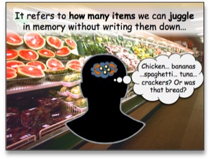 To informally assess how many chunks of information you can juggle at a time, all you’d have to do is visit a local supermarket without a shopping list when you have several things to buy. To informally assess how many chunks of information you can juggle at a time, all you’d have to do is visit a local supermarket without a shopping list when you have several things to buy.
Someone with an exceptionally good short-term memory (or a clever mnemonic aid) might be able to remember a long list of items to buy without ever having to write them them down.
Most of us, however, must depend on the use of a written list when our needs exceed a certain threshold. For example, I have found that my own item-juggling capacity accommodates only about three or four things before I really must make a list.
This same kind of juggling occurs when I’m rehearsing an unfamiliar phone number that I’ve just heard for the first time. I practice it only long enough to dial it — and then it quickly fades away!
How can we support working memory via our presentations?
As you can see, we’re dealing with a fragile, ephemeral processing system when we proceed to give a presentation — our audience’s brains! Therefore, we must strive to chunk our material into no more than 3 or 4 main sections or topics if we want our audiences to do any of the following:
- Understand our 3 or 4 topmost, takeaway ideas
- Store and retain that information for future use
- Retrieve and apply the key points correctly in the right situations
Another aspect of presentations that assaults our audience’s working memory is the repeated use of heavy text and bullet points. It takes extraordinary energy and effort for people to decode slide after slide of dense verbiage, and ultimately leads to the “glazed-over” effect.
Therefore, if we want our audiences to absorb what we’re saying, minimizing text is another effective way to support working memory.
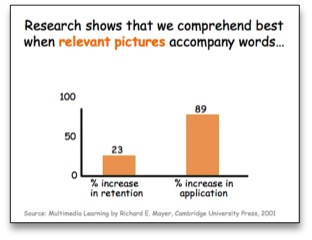 For example, multimedia-learning researcher Dr. Richard E. Mayer found that by simply incorporating relevant illustrations in text-only content, learners experienced the following benefits: For example, multimedia-learning researcher Dr. Richard E. Mayer found that by simply incorporating relevant illustrations in text-only content, learners experienced the following benefits:
- Retention increased by 23%, and
- The ability to apply the information increased by 89%.
His research has shown that pairing a relevant image with a descriptive sentence is ideal. That’s because people encode and store information more successfully when a complete sentence accompanies a graphic.
Just be aware that the more textual content you include in a slide, the more time it will take for your audience to decipher it as you deliver your live presentation.
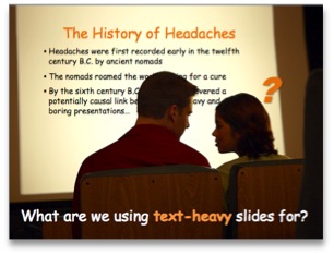
Why have we been using text-heavy slides in the first place?
Why do we treat our blank slide canvases like word-processing pages, and what are we using all of those bullet-heavy slides for? For our talking points, of course!
 Yet displaying our talking points on our slides is like inviting our audiences to watch a movie, but then requiring them to read the movie script instead of seeing the actual movie. Yet displaying our talking points on our slides is like inviting our audiences to watch a movie, but then requiring them to read the movie script instead of seeing the actual movie.
To our audiences, simply reading a script is not nearly as compelling or memorable as watching the movie itself.
Whenever we avoid using imagery in favor of typing speaker notes on our slides, it’s like telling the audience, “Here’s the script, folks! Go off and imagine the movie!”
A related problem... Displaying talking points on our slides is a crutch that tempts us to merely read them to our audiences — a presentation no-no! Further, when we are reading from our slides, our attendees are also trying to read from our slides. They can then experience another kind of “traffic jam” in working memory because there are too many visual and verbal things to attend to at once.
Research shows that average learners can usually do a small amount of reading while listening, but typically cannot do a lot of both with ease simultaneously. This is especially true if the pace is fairly fast and the material is relatively detailed. So, we have yet another reason to minimize text on our slides, in most cases.
In summary, today’s tips include the following:
1. Chunk your material into no more than 3 to 4 main sections or topics.
2. Minimize text, such as by combining a full sentence with a relevant image.
3. Don’t use your slides as a talking script or read your slides to the audience.
At this point, are you wondering any of the following?
- What elements should I leave in, and what should I leave off of my slides?
- Is there an advantage to eliminating text entirely from my presentations?
- Should I use any type of image, as long as it serves to replace some text?
Be sure to stay tuned for Part 2 when we will continue to explore these questions!
Copyright 2023 Adele Sommers |


 In a recent feature article, “
 "
"