Designing Information to Help People Act Quickly
by Adele Sommers
If you’re in the business of producing content, you’ll want your audiences to view both your how-to information, such as training materials and reference guides, and your persuasive information, such as advertisements, marketing blasts, and commercial announcements, with as few distractions as possible.
So, how do you keep people’s attention focused on what they need to do, and ensure that they can take fast action, especially if their success depends on speed?
As part of the solution, this article introduces five powerful information design techniques that can greatly increase your audience’s ability to quickly interpret and act on what you have to say.
But First, What Shortcomings Exist in Typical Information Design?
 On more than one occasion, you’ve probably encountered an incomprehensible user manual, a confusing memo, a bewildering procedure, or a mind-numbing software interface. On more than one occasion, you’ve probably encountered an incomprehensible user manual, a confusing memo, a bewildering procedure, or a mind-numbing software interface.
That means you’ve seen plenty of examples of dense, crowded, long-winded, run-on sentences; convoluted writing styles; and crammed layouts!
Why do all of these things matter?
A poor visual presentation can delay or even prevent someone from understanding and acting on your message! The consequences include:
- Less interesting and less productive interactions that rob people of their time.
- More mistakes and errors because people can’t accurately interpret what they’re reading, while the potential for harm and dissatisfaction skyrockets.
- Customers and employees going elsewhere, especially since there are plenty of competitors who can do the job better! But why let this happen to you when there are effective remedies available?
Information design principles can come to the rescue by:
- Easing the burden on the viewer’s brain by reducing the information overload.
- Working within the typical limitations of a viewer’s short-term memory.
- Using other extensively researched principles of perception and learning.
What Can We Improve Using Effective Information Design?
To remedy these areas of concern, we need to “grab people by the eyeballs” and give them more control over what we submit for their attention.

This means we must help our viewers or readers scan, skip, and retrieve — and then respond to the information quickly, before the relentless demands on their time and attention force their focus to shift elsewhere.
To accomplish this, the information we design needs to be “high-impact” to garner attention...
But it also must be “low-bandwidth” in terms of the effort and brain-power required to process it. The easier the information is to process, the more readily people will:
- Retain the information
- Retrieve it from memory under the right circumstances, and
- Apply it correctly
Five information design techniques that work like magic for this purpose include:
1) Classifying
2) Chunking
3) Arranging
4) Simplifying, and
5) Illustrating
These are all methods used in what’s called “structured information design.” The sections below briefly explain each one.
Technique 1: Classifying
Classifying organizes content into five distinct and actionable types, including: facts, concepts, processes, procedures, and principles.
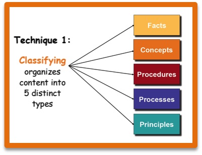
By categorizing our content into these five types, we can create segments of content that support one another.
For example, we often need to know certain facts and concepts before we can understand and apply procedures.
Here’s a breakdown of what each one of those five types of information refers to...
- Facts are unique, standalone bits of information. For example, this sentence, “Over 300,000 new book titles appear annually,” describes an unambiguous and precise collection of details that, when taken together, comprise a fact.
- Concepts represent general categories or classes of ideas or objects. For example, “dog,” “book,” and “weather” are all familiar concepts, and each represents many specific subtypes with unique characteristics. For instance, there are many distinct breeds of dogs, numerous book genres, and myriad weather patterns that all have specific identities and attributes.
- Processes illustrate how something works from a high-level point of view; they’re often depicted as flow diagrams. Common examples include physical processes that highlight how a piece of equipment works, and organizational processes that show the stages of a particular job or activity.
- Procedures are instructions that explain in detail how to do something. They typically reside below the level of processes, and identify the step-by-step actions required to perform a given task. They also can include conditional decision-making rules that specify what to do under certain circumstances.
- Principles are laws, theories, or guidelines that shape our interpretation of the world, such as in the physical, business, or behavioral realms. We often use principles to evaluate facts or data, for example, and develop relevant processes or procedures.
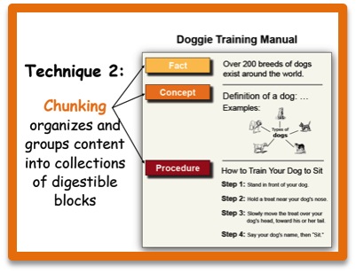
Technique 2: Chunking
Chunking breaks our content into smaller, more digestible messages.
 Why does chunking matter, and exactly what does it mean? Why does chunking matter, and exactly what does it mean?
Human short-term memory is limited; we can process only about 3 to 4 chunks of input at one time! That means we tend to “glaze over” when we’re bombarded with too much input simultaneously.
However, when we “chunk” content into smaller bites, we can reduce the data processing overload for the readers or viewers of our content.
In essence, chunking organizes and groups content into collections of digestible blocks. For example, an instruction guide on how to train a dog might contain three or more basic chunks: a fact about the number of dogs in a given breed, one or more concepts that provide definitions or detailed descriptions of that breed, and one or more procedures that list the steps for performing the actual training.
Technique 3: Arranging
Arranging text and graphics with visual cues helps people quickly scan, skip, and retrieve the precise details they need.
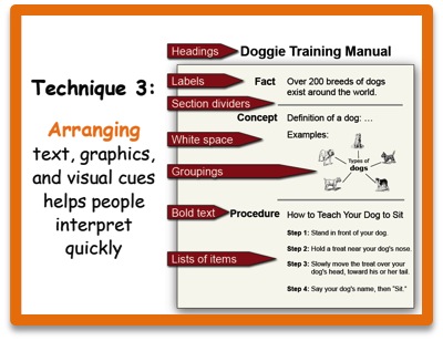 Examples of visual cues include bulleted lists, tables, white space, headings and subheadings, labels, bolded text, section dividers, groupings of related items, relative size, and hierarchies. Examples of visual cues include bulleted lists, tables, white space, headings and subheadings, labels, bolded text, section dividers, groupings of related items, relative size, and hierarchies.
A combination of cues helps viewers direct their gaze to exactly the places it needs to go to find the most relevant information — fast.
The research-based principles of visual perception that led to the development and refinement of this technique began with the important work of the Gestalt psychologists in the 1920s. Their experiments revealed that the use of spatial cues in visual media focuses human attention quickly and efficiently!
Technique 4: Simplifying
Simplifying uses very direct, “plain talk” to get ideas across unambiguously.
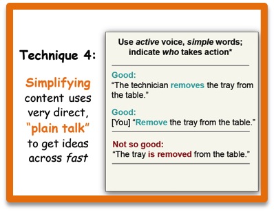 You should avoid “corporate-speak,” “academic-speak,” and a meandering writing style when you want people to respond rapidly. You should avoid “corporate-speak,” “academic-speak,” and a meandering writing style when you want people to respond rapidly.
Instead, use “plain talk,” which involves the active voice and clear, simple words and phrases.
Specifically, the active voice uses a noun followed by a verb to show who is taking action, as in:
“The technician removes the tray from the table.” (Do not say, “The tray is removed from the table.” That’s an example of the passive voice because you can’t tell who is supposed to take the action.)
Likewise, the instructions in procedures should be short, direct commands, as in: “Remove the tray from the table.” There should be no ambiguity about who is taking the action. When you’re using a command, it’s implied that the person who will be taking the action is “you.”
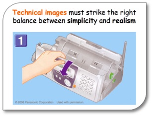
Technique 5: Illustrating
Illustrating reinforces or replaces text with graphic imagery.
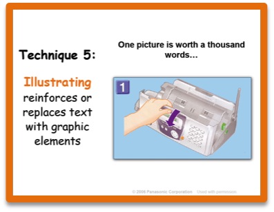 Have you heard the maxim, “One picture is worth a thousand words”? Have you heard the maxim, “One picture is worth a thousand words”?
A substantial body of research shows that using carefully crafted illustrations is more efficient and effective than prose to show procedural steps or depict key product features.
Excellent examples are the quick startup guides that come boxed with many types of devices.
Quick startup guides minimize or eliminate the need to have any familiarity with a particular language because they show all of the steps in a purely graphic format.
In conclusion, when designing your own how-to or persuasive information, try using structured information design methods to help your viewers interpret your message and take action as quickly as possible. By applying classifying, chunking, arranging, simplifying, and illustrating techniques, you’ll greatly boost their chances of success!
Copyright 2022 Adele Sommers |


 Today’s media-saturated world challenges people to comprehend and respond as rapidly as possible to a host of visual messages.