Tips on Using Text and Graphics for
Exceptional Slide Presentations
by Adele Sommers
Colleagues and clients often ask me, “What kinds of text and images should I put on my slides, and what kinds of visual elements should I leave off?” I tell them that if their goal is to make sure their slideshow gets their ideas across quickly, clearly, and memorably — and avoids creating a visual circus — simply follow the tips below.
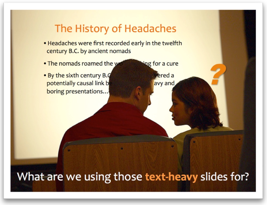
One of the most commonly asked questions revolves around how much text to put on slides. Historically, we’ve somehow acquired a bad habit of plastering our slides with line after line of teeny tiny wording. But why did we ever start using all of that text in the first place?
 For some reason, we’ve been taught to treat our slides like Word® documents, instead of like blank canvases where we can paint anything we want. For some reason, we’ve been taught to treat our slides like Word® documents, instead of like blank canvases where we can paint anything we want.
But why?
The traditional method of using text on our slides was to spell out our talking points (our narration script). Whether it was helpful to our audiences or not, we were supposed to write out everything we were going to say on the face of our slides. Then, we’d turn around and read from our slides so we wouldn’t forget anything important.
But displaying the talking points on our slides is like inviting our friends over to watch a movie — yet instead of showing them the actual movie, we’re requiring them to read the movie script instead.
Research shows that we can usually do a small amount of reading while listening, but typically we cannot do a lot of both simultaneously. That’s especially true if the speaker’s pace is fairly fast, and the subject matter is fairly meaty. So that’s yet another reason to minimize the amount of text on our slides!
So, how much text is the right amount?
 Small amounts of text are very helpful, and often necessary, to communicate the message on a slide. Small amounts of text are very helpful, and often necessary, to communicate the message on a slide.
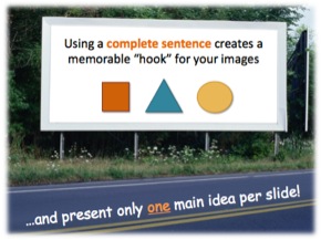
Text and graphics frequently go together, and it’s ideal to use a complete-sentence caption for a main image. Try to present only one primary idea per slide.
When you use a full sentence to describe a bold, relevant image, it gives your audience a much richer understanding of your key message than if you were to use text all by itself.
How large should the font size be?
You should aim for a minimum font size of 24 points or larger. That way, the text will be clearly legible from across a room for an in-person presentation, and also more readable on a small screen or mobile device.
Text should always appear on a high-contrast background color, such as dark letters on a white background, or light letters on dark shades of blue, brown, gray, black, and so on. Avoid mixing competing colors, such as red on blue or green, since the contrast between them is very poor. High contrast increases readability!

Is it OK not to use any text at all?
Yes, definitely! Sometimes no text is required because an exciting, self-explanatory graphic is the star of the show! Your spoken narrative can tell the story that the image helps accentuate, such as in the next example below.
What kinds of images should we use?
 We should always use images that are directly relevant to our content. We should always use images that are directly relevant to our content.
And some of the most effective graphics can be very simple and symbolic.
Also, it’s far better to use crisp photographs or high-quality illustrations instead of cartoon-like clip art.
Note: Relevant images do not include slide decorations, such as big logos and gaudy or noisy background patterns.
That kind of “eye candy” can actually reduce understanding. Why is that? Gratuitous graphics tend to compete with the content and become a hypnotic distraction that viewers must subconsciously find a way to ignore.
Here’s what happens with visual noise overload, and how you can fix it...
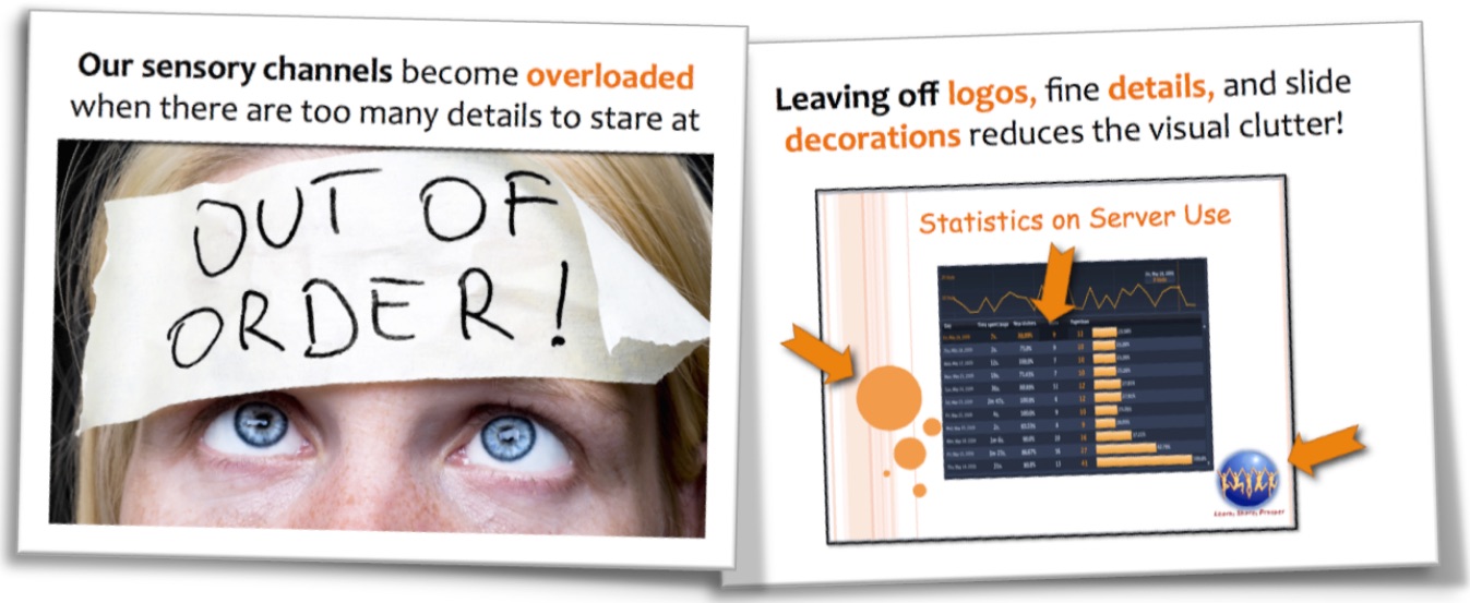
If your subject matter involves a lot of intricate details that are difficult to view on a slide, you should leave them off of the slide and put them into handouts instead!
What are some good sources of graphics?
Locating free, high-quality, royalty-free images that you have permission to use for business purposes is much easier than you might think. For example, Pixabay.com is an excellent resource. Other good sites are FreeImages.com and Freepik.com.
Important tip: Do not simply do an online search for images and then use anything that comes back. Assume that every image you see is copyrighted by the originator. This means that you cannot use the image without express permission, and you could be in legal jeopardy if you do. When in doubt about usage restrictions, be sure review the site’s or image’s terms of use very carefully.
In summary, it’s natural to be confused about which visuals to include, and more importantly, what to leave off of your presentation slides. For best results, use high-quality graphics combined with clear text captions or titles to give your audience an optimal visual experience. Leave off any tiny details and other visual clutter that would tend to overwhelm your audience, and put them in the handouts instead!
Copyright 2021 Adele Sommers
|


 Sick and tired of boring slide presentations? You’re in good company! Many people don’t yet know what’s required to create a truly effective slide show, and are equally turned off by viewing the ones that other people produce.