What Are the Goals and Costs of
Designing Memorable Presentations?
by Adele Sommers
 Are you tired of dull, boring, badly designed presentations? Are you tired of dull, boring, badly designed presentations?
Many people just aren’t sure of what’s required to produce a highly effective slide show, and are equally turned off by those that other people create.
Especially when the desired outcome of a presentation is to spark a certain kind of action, a lackluster message along with an uninspired delivery can result in a disappointing audience response.
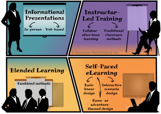
Does that sound familiar? If so, there’s no longer a need to subject anyone to exhaustion from a dry and antiquated style of presentation design. Particularly in the domain of informational presentations, we should carefully anticipate what we are attempting to accomplish.
This article highlights the overarching objectives of the design process, as well as how long it takes and how much it costs, on average, to produce a so-so, typical, or remarkable presentation.
Presentation Goals: What Are We Trying to Achieve?
 Many people design their presentations to educate, engage, persuade, and motivate attendees to take some kind of action. Based on the theme of a given talk, what might those calls to action entail? Common examples include: Many people design their presentations to educate, engage, persuade, and motivate attendees to take some kind of action. Based on the theme of a given talk, what might those calls to action entail? Common examples include:
- Pursuing the next step in a sales process
- Scheduling a follow-up meeting or workshop
- Practicing and applying newly acquired skills
- Drafting a policy to address an important issue
- Making some other type of critical commitment
In contrast, simply producing passive awareness should not be considered a compelling reason to ask for an audience’s attention. Awareness alone would not justify the time attendees are taking to attend, or the initial investment in producing the presentation in the first place!
Overall, What Should Our Presentation Design Process Include?
The design process should carefully consider the audience’s characteristics to craft the right message and avoid overloading the listeners. My award-winning formula, “Art + Science + Story = Impact,” uses research-based storytelling and graphic design principles to communicate compelling, memorable, and actionable ideas.
Art + Science + Story = Impact!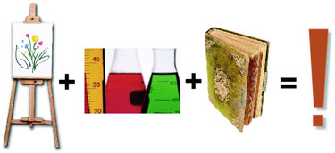
This formula involves a three-part structure to set up, introduce, and embellish the presentation narrative. It “chunks” the content into digestible segments by boiling it down to just a few main topics with relevant supporting detail.
Learn more about each of the three parts, next…
Part 1: What do we want to communicate first?
Part 1 orients the audience by focusing on a challenge that the audience is facing, and then recommends a solution and call to action. In this context, it becomes clear that the audience has the starring role, and will be hearing a clear portrayal of what issues matter most and how to predict, prevent, embrace, or solve them.
What to avoid: Focusing the introduction mainly on the presenter’s qualifications, the company’s history, and so forth. You can always broach those details later. The primary purpose of Part 1 is to galvanize the audience’s attention and keep it riveted by ensuring that the audience clearly knows “what’s in it for me” (WIIFM)!
Part 2: What do we want to communicate next?
Part 2 next “develops the action” by expanding the three to four main points of the solution introduced in Part 1. The goal is to present each main point and then summarize it before moving on to the next one.
 It’s important to organize our content into no more than about three to four main “suitcases” of ideas, which will represent the overarching topic structure. It’s important to organize our content into no more than about three to four main “suitcases” of ideas, which will represent the overarching topic structure.
This strategy reduces audience overload by focusing on the most memorable “takeaways.”
It’s far easier for attendees to take away a short list of big ideas than attempt to carry off many disparate small ones.
“Chunking” our content greatly strengthens our audience’s ability to understand, assimilate, and recall our primary ideas, especially in a training setting. Further, the use of handouts to convey both the primary points and the supporting details gives attendees short- and long-term memory support, and thereby conserves their limited listening capacity. Handouts also act as quick-reference aids that people can return to for making decisions long after the presentation is over!
Part 3: How should we conclude?
Part 3 recaps the problem, solution, and the call to action to help the audience fully digest the story, including the main points, implications, dangers, solution, options, and so on. This short, dramatic segment sums up and concludes the presentation.
In these final moments, the sense of excitement, insight, inspiration, urgency, clarity, resolve, and other emotions that the audience ought to be feeling reaches a crescendo. These motivational elements must find an immediate outlet in a clear-cut invitation or direction to take the next step — some kind of action. Otherwise, the opportunity to channel the audience’s readiness to act may be completely wasted!
How Long Do Informational Presentations Take to Create?
In 2010, the Chapman Alliance published a comprehensive research study* on how long it takes to design and develop one hour of finished presentation-based training, from the simplest type (in the low-range category) to the most complex (in the high-range category).
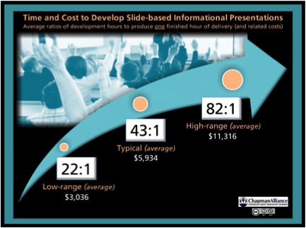
(Click the image to enlarge)
The time and cost to produce slide-based informational presentations is very similar to that for producing training that involves a slide deck, handouts and/or workbooks, and a structured narrative. The study breaks down the time and cost into three main categories — 1) low-range, no-frills; 2) typical; and 3) high-range, truly exceptional presentations. So, what are the development times and costs?
Low-range (average):
This level consists mainly of simple content, usually rapidly developed, possibly repurposed from existing source material, and with minimal print-based support materials. It requires an average of 22 hours to produce a one-hour session (or about $3,036, based on the average, per-hour cost of a “typical” production).
Typical (average):
This level represents the norm for corporate informational presentations that involve a slide presentation, handouts, and a structured narrative or lesson plan. The slide deck may be relatively traditional, with mostly bullet points and some graphics. It requires an average of 43 hours (or about $5,934) to produce a one-hour session.
High-range (average):
This level often entails complex subject matter, highly custom slide design, and additional time spent on developing support materials. These tend to be the most memorable, attention-getting, and actionable presentations. Since the design is uniquely compelling and of very high quality, these presentations stand apart from the run-of-the-mill, bullet-point-heavy slide displays. This level requires about 82 hours to produce a one-hour session (or about $11,316, based on the average, per-hour cost of a “typical” production).
_________________
*Data source:
Chapman, B. (2010). How Long Does It Take to Create Learning? [Research Study]. Published by Chapman Alliance LLC, available from chapmanalliance.com. Image was used and adapted with permission. The data contained in this research was collected from 249 organizations, representing 3,947 learning development professionals, who have created classroom-based and eLearning content that has been consumed by 19,875,946 learners.
In conclusion, an engaging slide presentation helps broadcast a clear, powerful message; you might have only one chance to communicate your ideas effectively.
But if you carefully plan your overarching messaging strategy, you can apply the
Art + Science + Story = Impact formula to make each presentation a smashing success!
Copyright 2023 Adele Sommers
|